Earthsky.org - 5/30/13, Deborah Byrd

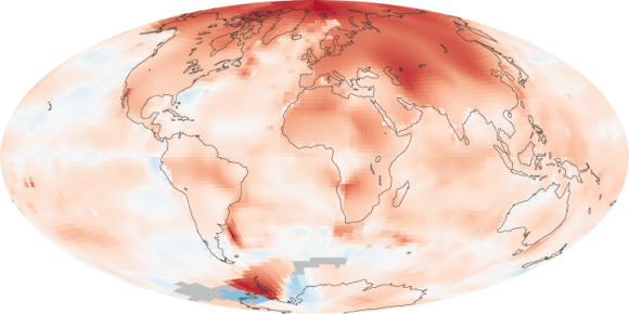
Global temperature anomalies. This map is comparing temperatures in the years 2000 to 2009 to temperatures norms elsewhere from 1951 to 1980. You can see that – during this period – the Arctic warmed more dramatically than other parts of the globe. Image via NASA.
This map shows how high latitudes on Earth – the Arctic – have warmed more dramatically over the past decades than other parts of the globe. The map shows global temperature anomalies for the years 2000 to 2009. In other words, it doesn’t show absolute temperatures. Instead, it illustrates how much warmer or colder a region was in 2000-2009 compared to the norm for 1951-1980.


